Shutterstock Rebrand

Shutterstock Rebrand

Shutterstock Rebrand

Shutterstock’s bold new visual identity reintroduces itself as the essential, universal ingredient brands need to make their work more effective. This rebrand marks Shutterstock's strategic evolution as a family of brands delivering scalable creative and GenAI solutions to help customers fuel great work.

Role: Designer

Creative Lead: Meg Vazquez-Pastrana

Art Directors: Nicole Dai, Thanh Nguyen

Motion Director: Marcel Morschhauser

Designers: Abi Gaudreau, Hale Jung, Kate Voisin, Veronica Elaine

Deliverables:

+ Deck Design         + Office Murals         + Event Spaces         + Digital Screens         + Swag         + Landing Page
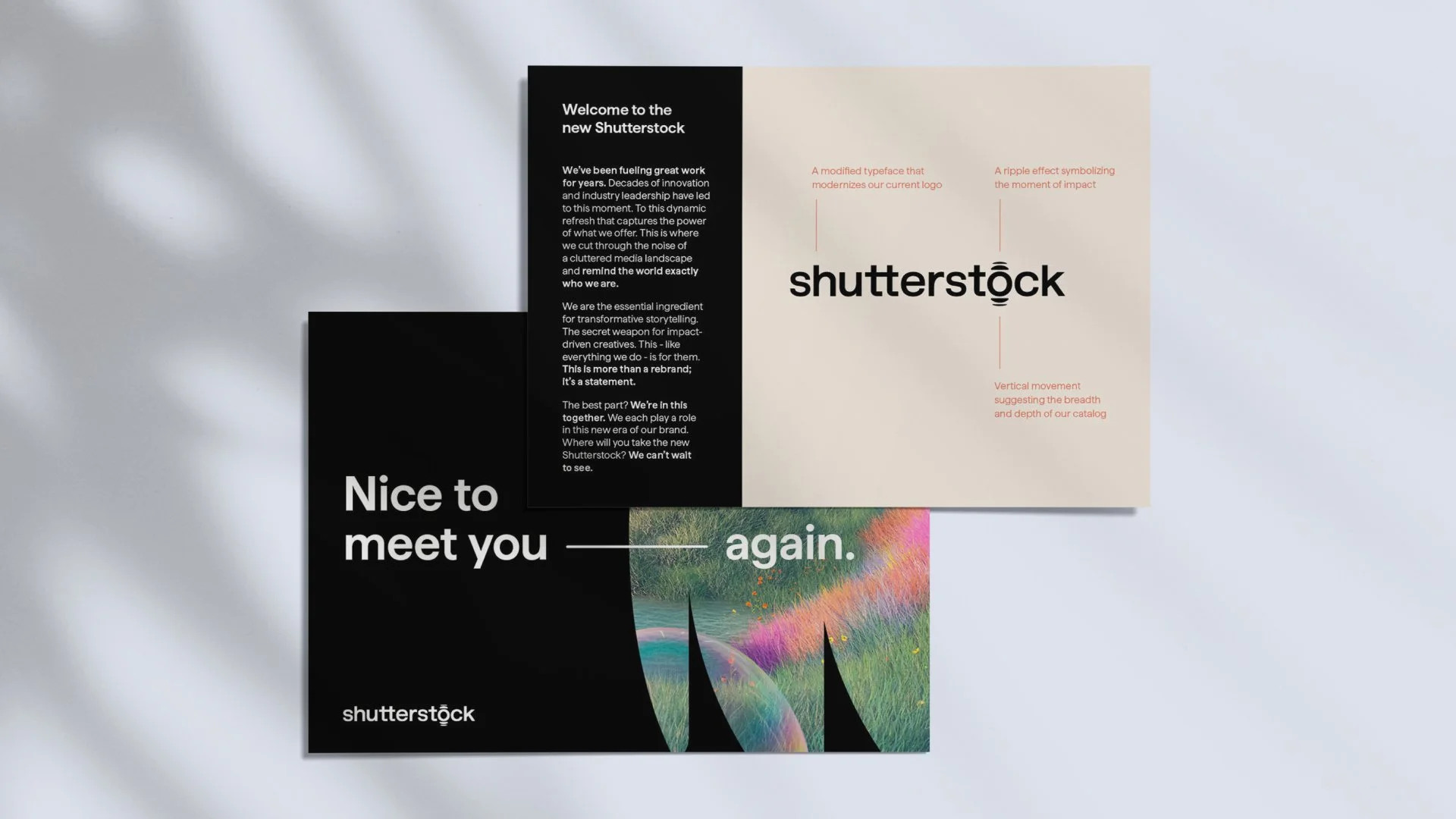
A two-page brochure with a black and white design. The left page has the message 'Nice to meet you again.' and the Shutterstock logo at the bottom. The right page introduces a new Shutterstock logo, with descriptive annotations about its modern design, ripple effect, and vertical movement, alongside a welcome message and information about the brand refresh.
Collage of colorful stickers and illustrations including a woman sitting, a Rubik's cube, a mountain photo, a camera, headphones, a keyboard, and various words like 'fuel,' 'great,' 'work,' 'the essential ingredient,' and notes about impact and amplifying voices.
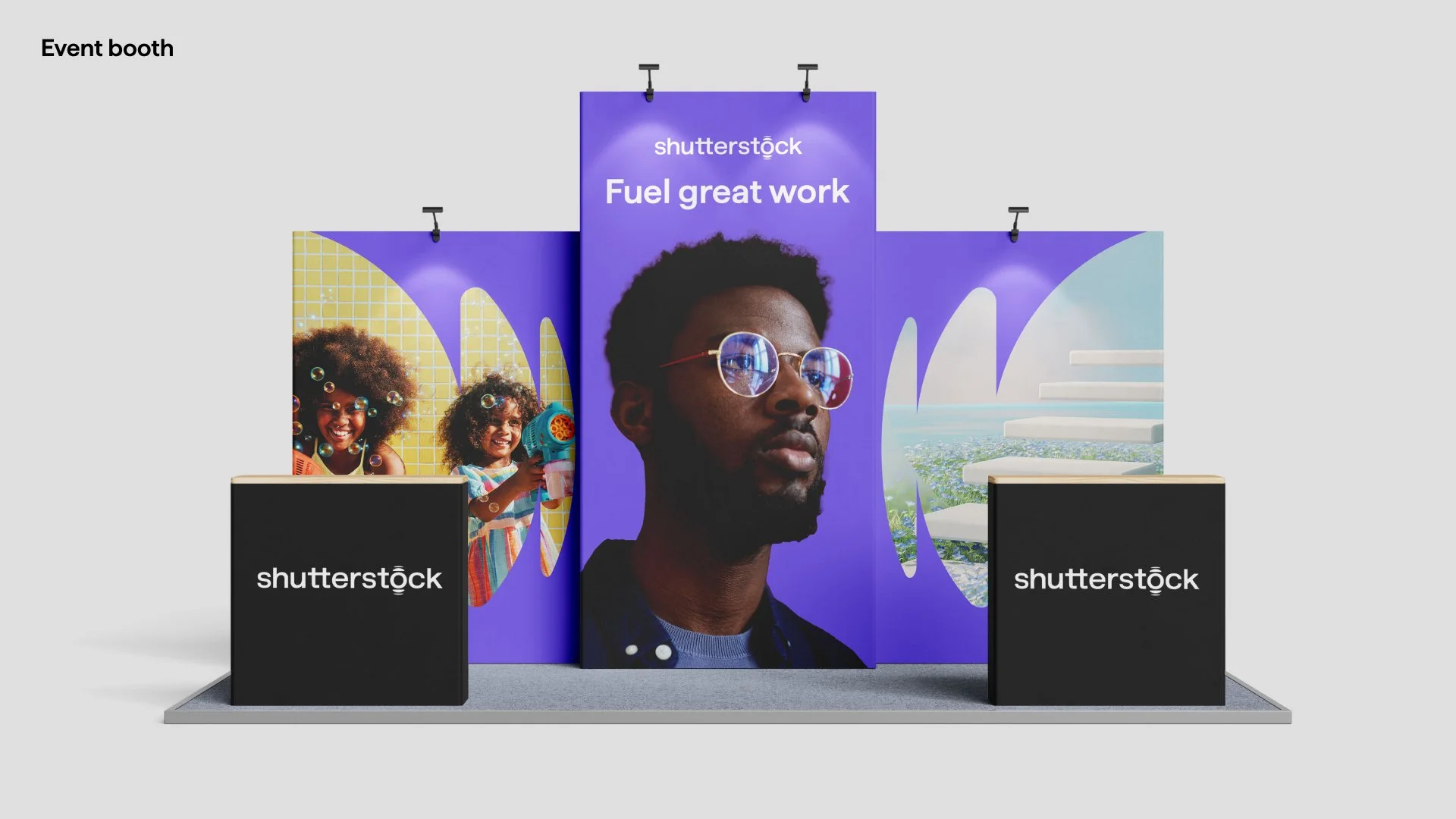
A collage of photos from a Shutterstock event featuring presentations, a reception area, attendees with branded merchandise, and promotional displays with the 'Fuel great work' slogan.
Three posters on a tiled wall. The first features a smiling man in glasses sitting in a green chair with the text "Helping real business leaders." The second shows a group of people having a discussion in a bright room with the text "make real impact." The third is a black poster with white text listing words: "marketplace, studios, data, distribution."
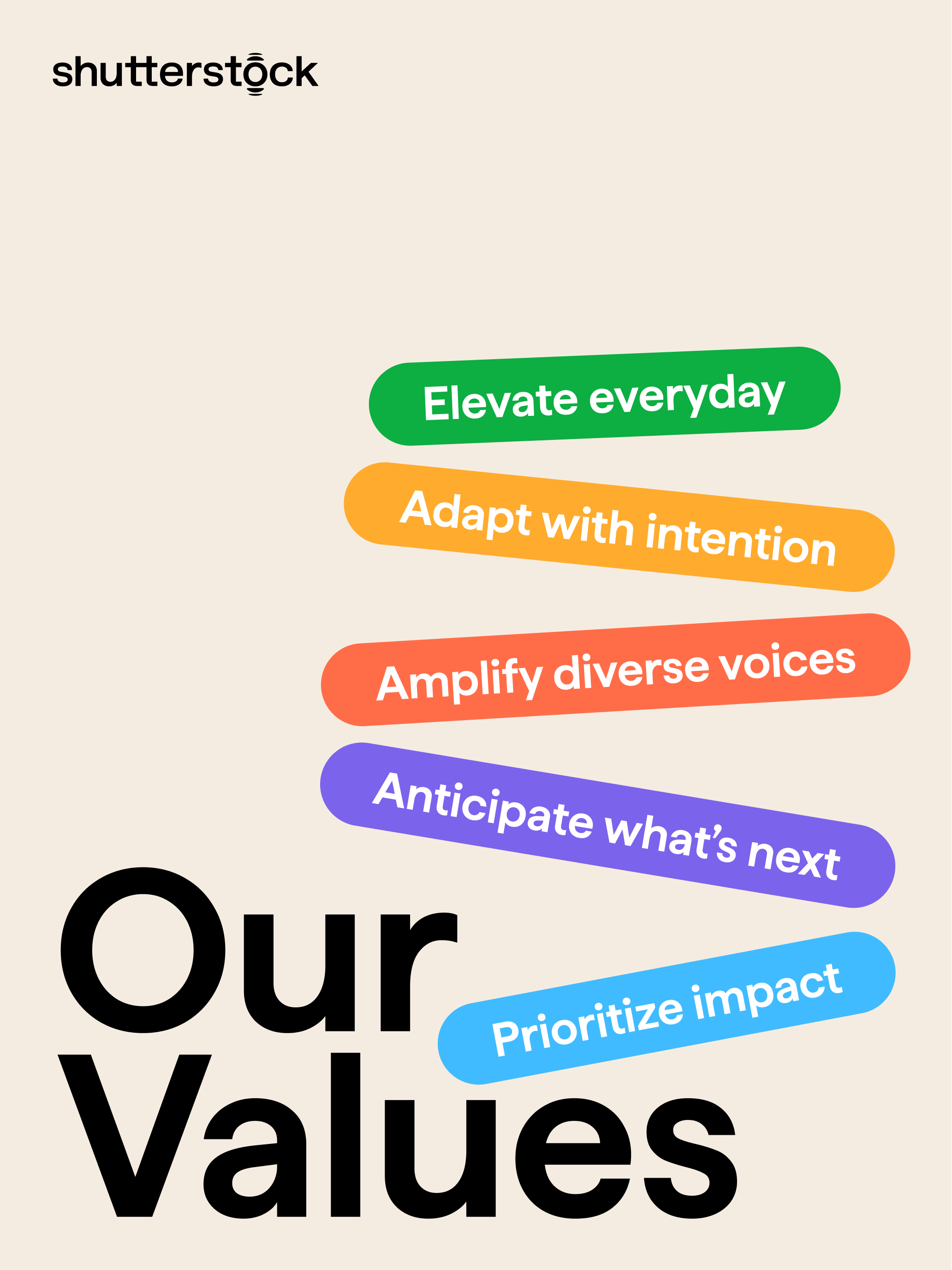
Graphic listing core values: Stock photo title, four colored text phrases and bold black text for 'Our Values' on beige background. Phrases include 'Elevate everyday' in green, 'Adapt with intention' in orange, 'Amplify diverse voices' in red, 'Anticipate what's next' in purple, and 'Prioritize impact' in blue.